Tradebeyond • 2024-25
UIUX Design
System Thinking
"0" to 1
Prototyping
B2B

Background
Tradebeyond is a SaaS company providing solution for retailer to manage their supply chain operation. Our inspection app allowing inspectors to document and record products quality at the factory. These product can be soft goods like apparel and hard goods like machine. In 2023, Tradebeyond made a strategic move by acquiring Pivot88, with one of the key objectives being the integration of both companies' inspection products. The goal was to create a single inspection app and compete to become the leading product in the market.
I was in charge of the UI/UX design on this project from ideation to implementation.
Challenges
Like all major revamp project, the biggest challenge will be the backlash of user when they transit to the new product. Therefore, the new app needs to be easily pick up by existing user while solving UI/UX issues in the legacy apps.


Design Process
In the early-stage, we had concluded to design the new app base on Pivot88 app due to the much larger user base they have. Doing so can reduce re-training to majority of current user. To overcome the challenge, I follow the process below when designing the new inspection app.

Since I am using Pivot88's design as base, most work lies in designing a new set of UI that both Pivot88 & Tradebeyond existing inspection app can fit into. Click here to view the case study on how I establish the design system for the new inspection app, as well as other Tradebeyond's product.
Key Design
1.) Redesign Measurement Keyboard
During the inspection, inspector needs to log the measurement of the product at different POM (Point of Measurement). For instance, the inspector might need to check the sleeve length or the shoulder width of a T-shirt. To do so, they first click on the cell of the POM they are measuring, an overlay will appear with the target value inputted. Then they can either change the value by clicking the "-" & "+" or click the arrow to move on to next cell.
The old design has some usability issues:

Blocking POM header
The overlay cover the POM name which user complain about.
Constant changing on-screen position
The overlay constantly changes position when navigating. Creating excessive touch motion.
Troublesome to open keypad
Require an extra click to access the keypad
The new design fixes the issue by :
Fixed Keyboard
Static touch area for ease of use

Combined Keypad & Nudge Control
User can now adjust the intervals while directly type in the keypad
As-is
New
2.) Introduce AQL Meter (Result Visualization)
In the summary section, the result is calculated by a industry rule call AQL. This rule determine whether the numbers of defect found (e.g. critical or major defect) is accept or reject.
The old design shows the numbers in a table view, which is not intuitive to interpret. Therefore a new design is introduced with the aim to:
1
Improve Hierarchy
2
Visualize Value
3
Colorize for Clarity

Tradebeyond Legacy Inspection App using table to show summary
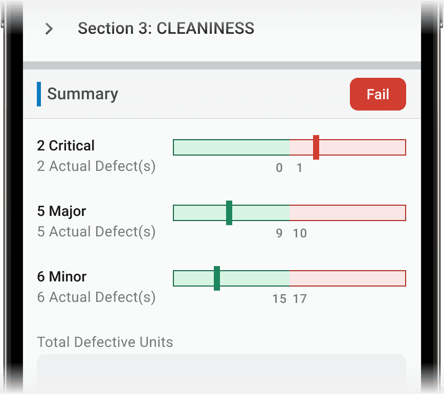
New design using a "AQL Meter" to indicate result by the bar's position and color
3.) Added Responsive Design
Neither the existing apps have proper responsive design as they are mainly design for tablet. For the new inspection app, a UX friendly mobile view is consider to be a selling point. Therefore, certain parts of the app need to be optimize for smaller screen.

Navigation Bar
As-is

Bottom tab become crowded in mobile view if there is too many pages.
New

Menu button on the left to trigger bottom sheet menu; Navigation button on the right to switch between sections


Tablet continue uses bottom tab bar

Info Data
As-is

A table in mobile view require constant horizontal scroll to read all the information in it.
New
Mobile table switch to a vertical orientation for easier viewing. It can also collapse and expand.

Tablet continue uses full size table
4.) Improve Result Indicator
One of the pain point of inspector during inspection is they always have to scroll away to check out the current report result. A global result indicator is introduced to allow inspector to beware of the current report status constantly. They can also click on it to view the detail summary.
As-is
New
5.) Mandatory Field Alert Prompt

User Story
"As an inspector, I want to have a quick way to go through unfilled mandatory fields , so that I don't have to find them manually"
To address this, a mandatory field alert prompt design is introduce to facilitate inspector to quickly finish the report with quick navigation to mandatory field.
User can expand the alert prompt and click through the mandatory field. Alert prompt will auto minimize upon scrolling away